
General4:5 or 1:1
Testimonial Ad
Image PromptRunway PromptStoryboard
Create a proof-led ad structure with credibility, quote space, and a clean conversion-oriented product layout. The visual direction is guided by the main reference image.
Build a structured comparison visual with clear side-by-side logic, product hierarchy, and persuasive simplicity. The visual direction is guided by the main reference image.
Use the main reference image as the visual anchor for composition, lighting, color palette, product placement, and prompt interpretation.
Use this template
Copy the Image Prompt, Runway Prompt, or storyboard and drop the template straight into your next campaign workflow.
Download Free Pack
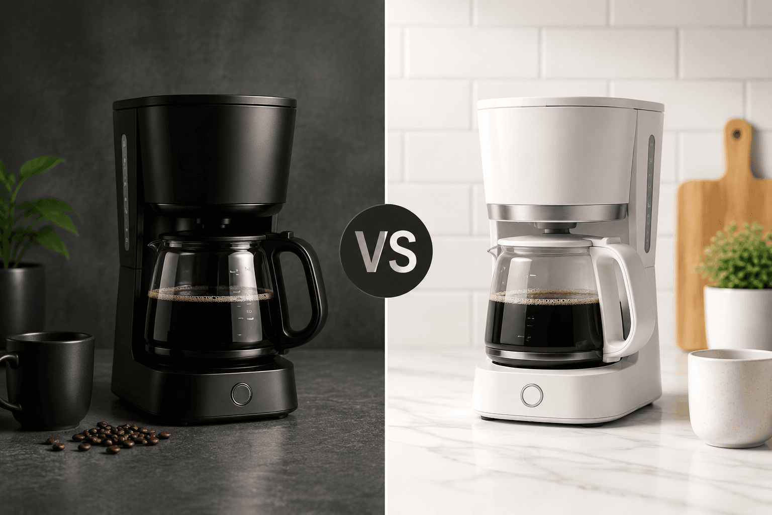

Use the main reference image as the visual anchor. Treat the other reference images only as supporting cues for texture, props, or framing. comparison ad creative with clean side-by-side layout, strong product hierarchy, persuasive clarity, premium campaign composition, structured difference-driven visual storytelling --ar 4:5 --v 6
Use the main reference image as the visual anchor. Treat the other reference images only as supporting cues for texture, props, or framing. A clean side-by-side layout establishes comparison logic while the product or offer remains easy to scan. Motion stays restrained and clarity-led until the final comparison frame settles.
Storyboard
A clean split layout establishes immediate comparison logic. Keep the frame aligned with the main reference image.
Differences become clear while the product hierarchy stays easy to understand. Keep the frame aligned with the main reference image.
The final frame balances persuasion, readability, and CTA space. Keep the frame aligned with the main reference image.
Use the main reference image for angle, crop, and subject hierarchy. Use a clean two-zone or modular layout with clear side-by-side hierarchy.
Match the lighting logic of the main reference image first. Use consistent lighting across both comparison zones to keep the contrast readable.
Keep motion choices consistent with the main reference image. Use subtle transitions between the two zones and a stable final comparison lockup.
They work best when the audience already understands the category and needs a clearer reason to choose one option.
Yes. Keep the layout clean, the message simple, and the lighting consistent rather than overloading the frame with claims.
Use the main reference image for composition, lighting, palette, and product focus. Use the other reference images as secondary support.
Create a proof-led ad structure with credibility, quote space, and a clean conversion-oriented product layout. The visual direction is guided by the main reference image.

Create a conversion-ready retargeting frame with clear product focus, direct offer hierarchy, and polished sales intent. The visual direction is guided by the main reference image.

Build a carousel-ready visual framework with product sequence logic, clean card hierarchy, and conversion-friendly storytelling. The visual direction is guided by the main reference image.