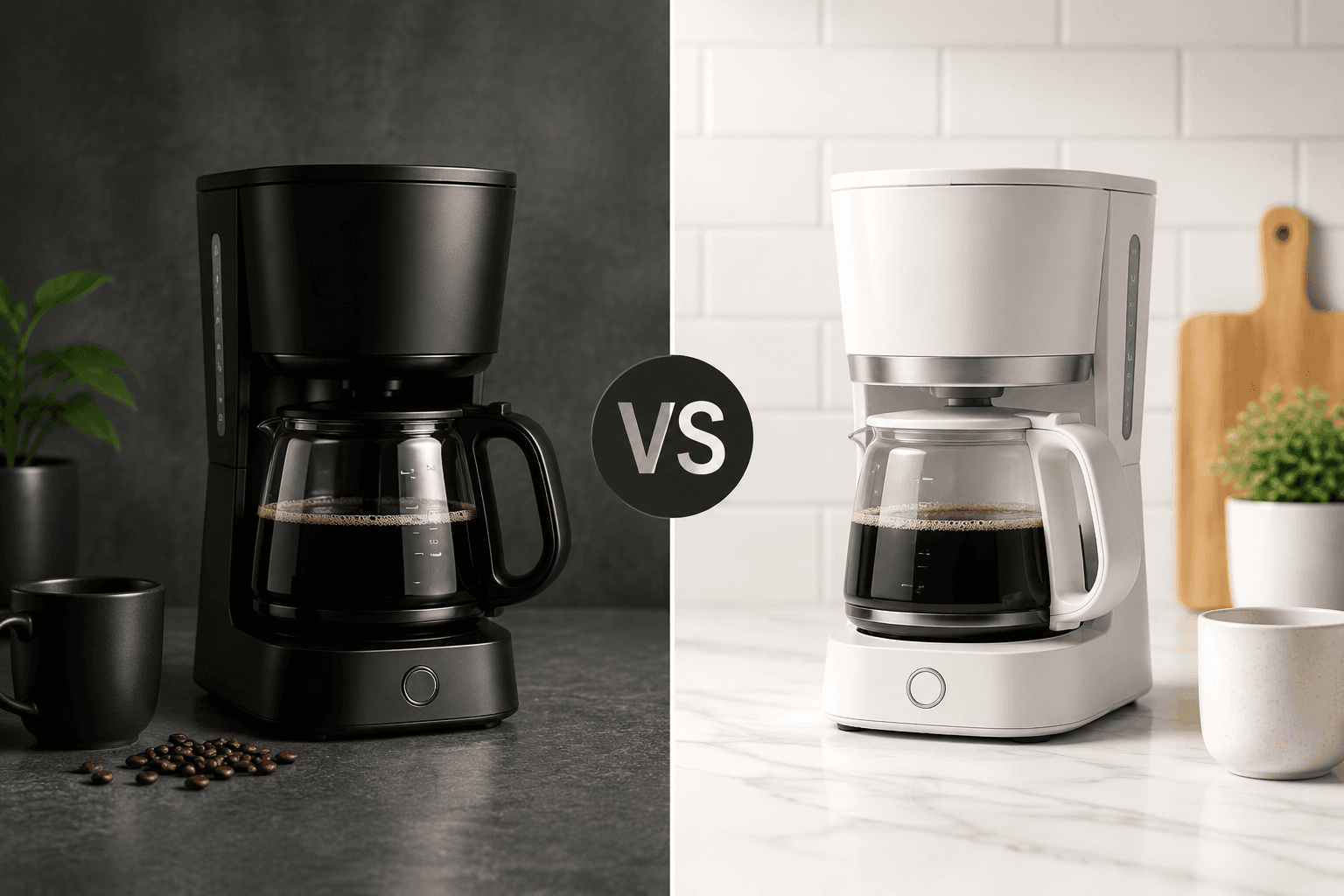
General4:5 or 16:9
Comparison Ad
Image PromptRunway PromptStoryboard
Build a structured comparison visual with clear side-by-side logic, product hierarchy, and persuasive simplicity. The visual direction is guided by the main reference image.
Build a carousel-ready visual framework with product sequence logic, clean card hierarchy, and conversion-friendly storytelling. The visual direction is guided by the main reference image.
Use the main reference image as the visual anchor for composition, lighting, color palette, product placement, and prompt interpretation.
Use this template
Copy the Image Prompt, Runway Prompt, or storyboard and drop the template straight into your next campaign workflow.
Download Free Pack
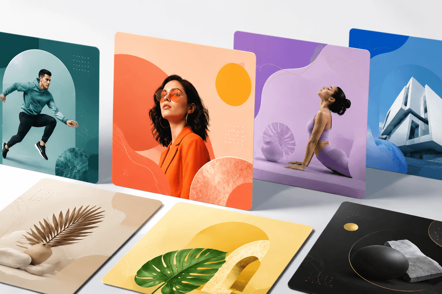

Use the main reference image as the visual anchor. Treat the other reference images only as supporting cues for texture, props, or framing. multiple abstract social ad cards arranged in perspective on a clean studio surface, modern Meta carousel campaign visual system, bright professional lighting, colorful premium marketing style, no readable text, no logos --ar 4:5 --v 6
Use the main reference image as the visual anchor. Treat the other reference images only as supporting cues for texture, props, or framing. A sequence of abstract ad cards slides into perspective, creating a clean social carousel system. Motion emphasizes card-to-card hierarchy and ends on a polished conversion-friendly carousel hero.
Storyboard
A first abstract ad card establishes the social carousel structure. Keep the frame aligned with the main reference image.
Additional cards slide into perspective with clear sequence hierarchy. Keep the frame aligned with the main reference image.
The final frame holds a polished carousel system with space for campaign messaging. Keep the frame aligned with the main reference image.
Use the main reference image for angle, crop, and subject hierarchy. Use a perspective card layout with enough spacing to show sequence without clutter.
Match the lighting logic of the main reference image first. Use bright professional studio light with premium color accents and no readable text.
Keep motion choices consistent with the main reference image. Use smooth card slide-ins, subtle depth shifts, and a clean final carousel lockup.
Carousel ads usually perform better when the visual language carries consistently from the first card through the rest.
Yes. Carousel structures are especially useful for bundles, before-and-after flows, features, and multiple SKUs.
Use the main reference image for composition, lighting, palette, and product focus. Use the other reference images as secondary support.
Build a structured comparison visual with clear side-by-side logic, product hierarchy, and persuasive simplicity. The visual direction is guided by the main reference image.
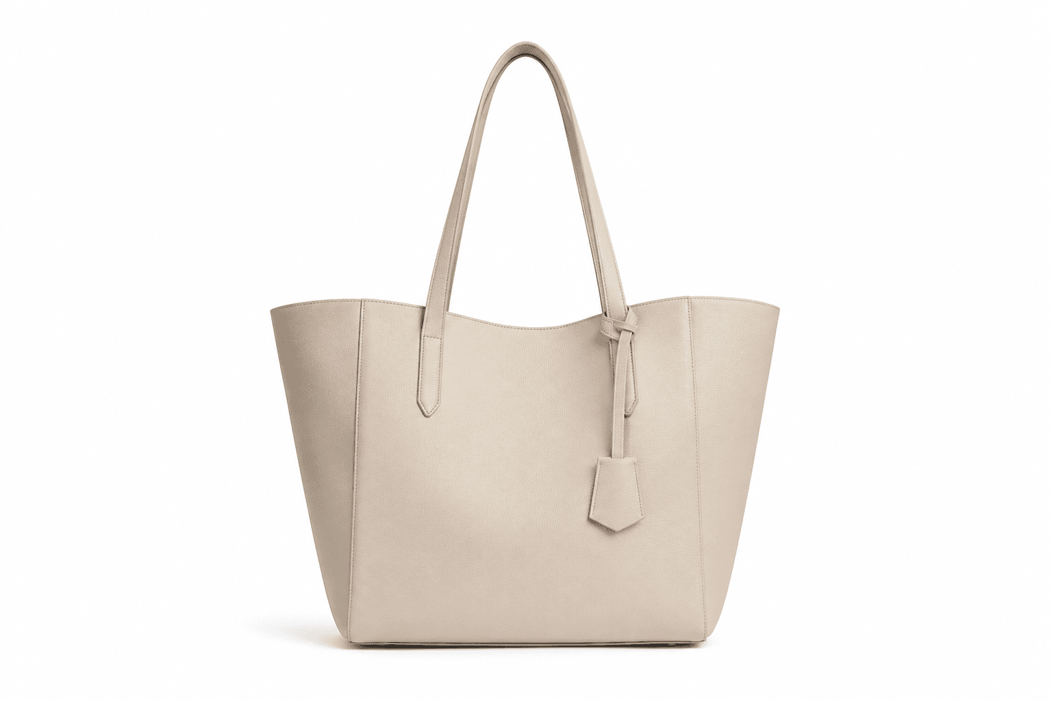
Build a clean ecommerce hero with readable packaging, conversion-ready layout space, and polished lighting. The visual direction is guided by the main reference image.